Introduction
I listened to an interesting episode of Syntax a while ago, which is a web development podcast by Wes Bos and Scott Tolinski. The episode was about making websites that are accessible to everybody.
This got me thinking about opportunities to improve how EIA documents are created. Not everyone has the abilities many of us take for granted, such as using a mouse or keyboard, or reading with our eyes.
In this post I’ll outline what accessibility is in the context of an EIA and why EIA documents should be accessible I’ll also discuss some principles and tools to help make documents more accessible.
This is the first in a series of posts on more effective transfer of information in EIA documents. Future posts will consider:
- comprehensibility - can the EIA be easily understood?
- usability - can the information in the EIA be easily navigated?
These concepts are relevant to the effective transfer of information in an EIA document to its audience. While the context of this post is EIA documents, the ideas discussed can be applied to any technical documents.
What is Accessibility?
So, what is accessibility? The Wikipedia article on the topic views accessibility as:
the “ability to access” and benefit from some system or entity
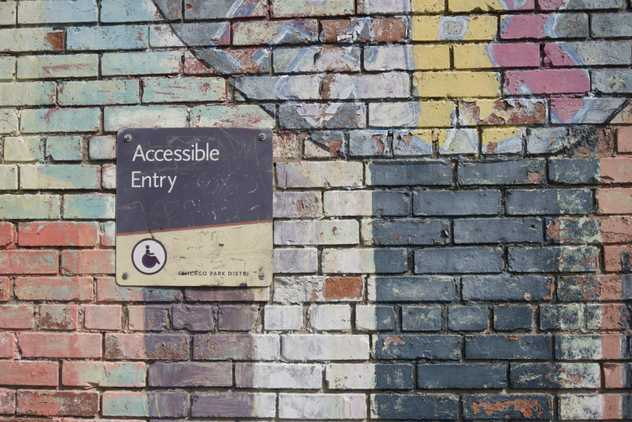
This is a great starting point and is relevant in lots of applications. You’ve probably seen improvements to accessibility in built environments, such as wheelchair ramps on busses, slings in swimming pools and handrails in buildings.
Accessible EIA documents lower the barriers for the transfer of information to the audience. Typical EIA audiences include people with a range of physical and cognitive ability. By writing EIA documents in an accessible way, we can make these documents more inclusive and easier for everyone to consume.
Why Worry About Accessibility?
In my experience, most proponents write EIA documents for an environmental regulator. All other audiences, such as the public or employees, are a secondary consideration. This is understandable - a proponent seeking an environmental approval must get regulatory consent; hence, their focus is on the regulator as an audience. Environmental regulators generally have guidelines on the content requirements in EIA documents and assessment criteria that proponents must meet. Usually, the structure and content of EIA documents are crafted to meet these guidelines and assessment criteria.
Assessment officers within environmental regulators usually have access to technical experts that assess EIA documents. Their job is to assess an EIA against their regulatory requirements, no matter how hard it is to read. The benefits of making EIA documents for this audience may seem negligible. However, it may result in a more efficient approvals process if the need for clarifications or information requests during assessment are reduced.
A social licence to operate is becoming increasingly important for EIA proponents, and accessible EIA documents can help build and maintain it. Making EIA documents more accessible to the public may increase their understanding of environmental impacts and risks. This can facilitate more meaningful stakeholder engagement. It can also demonstrate a proponent’s intent to be transparent.
Employees and contractors are typically responsible for implementing the actions that have been assessed. Making EIA documents accessible can reduce the risk of them not complying with environmental approval conditions, such as limits on the nature and scale of activities or applying mitigation measures. There’s lots of other ways to mitigate this risk, but an accessible EIA document doesn’t hurt.
How Can I Improve Accessibility?
Improving accessibility of EIA documents is often very simple and can be done for little or no cost. Below are some ideas that you might find useful to improve accessibility in EIA documents.
Typefaces and Fonts
The typefaces and fonts used in EIA documents often don’t get a lot of thought. But they can have a huge effect on how easy it is for a reader to parse the text in a document.
WebAIM have a useful page on typefaces and fonts, and I encourage you to read it. I’ve summarised some of the typeface readability principles from that page in the points below:
- Use simple, familiar, and easily parsed fonts. There’s a reason Arial and Helvetica are so common - they’re generally easy to parse.
- Avoid character complexity. Calligraphic fonts can look beautiful but can be a burden for the reader.
- Avoid character ambiguity. Upper-case letter O and the number zero (0) can be very hard to differentiate in some typefaces. So can lower-case letter l and the number one (1).
- Use a limited number of typefaces, fonts, and font variations.
- Consider spacing and weight. This includes spacing between fonts (kerning), spacing between words and line spacing.
- Ensure sufficient, but not too much, contrast between the text and the background. See the discussion below for my thoughts on contrast.
- Avoid small font sizes and other anti-patterns.
Lots of government signage comply with these points - street signs, public transport signage, etc. These signs are intended to convey meaning rapidly and clearly - something we should aspire to in EIA documents.
Fonts in figures and graphs in EIA documents warrant special consideration. Figures like maps and graphs imported into an EIA document are often in a raster format. This can result in text in the raster image being pixelated and hard to read. Solutions to this include:
- making sure the text in the image is of sufficient size,
- maintaining image resolution as high as practicable, and
- using a vector-based format, such as scalable vector graphics or enhanced metafiles.
Consider using the same typefaces and fonts as an EIA document help maintain consistency (see bullet points above).
I’ve often seen GIS figures intended for a specific page size being used at the wrong scale. A3 figures used as A4 size, and A4 figures at A5 sizes are common examples. This can make the maps very hard to read. Make sure maps are used at the page size the cartographer intended.
Provide Sufficient Colour Contrast
Having sufficient contrast between elements of EIA documents helps all visual readers, particularly visually impaired readers. Elements where text set in front of a graphic or photo is where problems frequently occur. Often these elements are what you want to draw the reader’s attention to, so it’s important to have sufficient contrast to make them accessible. Contrast in body text usually isn’t an issue - black text on a white background provides strong contrast between elements.
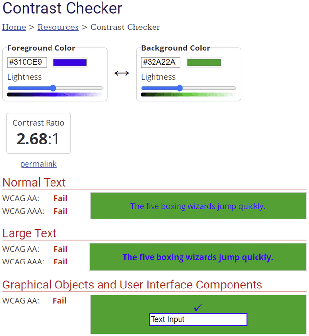
I use the WebAIM Contrast Checker to check contrast accessibility. This tool measures the contrast ratio between elements, such as text and the background. It provides easy to use tests for normal text, large text (e.g., headings), graphical objects and user interface components. The contrast ratio tests are aligned with the Web Content Accessibility Guidelines (WCAG) 2 requirements. More in the WCAG later…
The screenshot below is an example of the WebAIM Contrast Checker interface. Just enter the hexadecimal value for the colours you want to compare, and it will return the test results. If you’re working in RGB colours (e.g., Microsoft Word), there’s lots of converters available on the web to get the hexadecimal equivalent.
Be Colour Blind Friendly
Colour blindness is the decreased ability to see colours, or differences in colours. The most common type impairs the ability to distinguish red and green, but there are other types too. Colour blindness tends to be a barrier to accessibility in figures, such as maps, charts, and photos, rather than text. You can make your documents more accessible for people with colour-vision impairment by:
- Avoiding using colour coding or colour contrasts alone to convey meaning. This is important for GIS maps - consider using styles (e.g., dashed lines or unique point styles) and fills (e.g., line or shading fills) as well as colour to distinguish elements on a map. This has the additional benefit of being easier to read when printed in greyscale.
- Avoid using low contrast colouring between text and background. I’ve usually seen this deficiency with stand-out text on document covers or in call-out boxes. Glossy documents, such as brochures, are typically more of a problem than EIA documents in my experience.
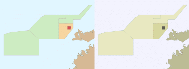
The image below shows zoning for the Oceanic Shoal Marine Park using a spectral palette (click on the image for a larger version). The symbology just uses colour to distinguish between zoning. The panel on the left is the normal rendering, while the panel on the right simulates red-green colour blindness in QGIS. The zoning can be distinguished in both, but it can be improved.
Compare this with the same map rendered below using a colour blind friendly palette (click on the image for a larger version). On the left is the normal rendering, and on the right is the rendering using the red-green colour blindness simulator. The fill of the map elements now uses fill textures, and the background colour is white. It’s much easier for someone with red-green colour blindness to interpret this figure.
Below are some tools I’ve found useful in trying to make my work colour blind friendly:
- Simulate colour blindness in QGIS.
I use QGIS lots for maps - it’s a lovely GIS package.
One of the tools in QGIS modifies the colours in a map to simulate colour blindness.
I used this tool to generate the renderings of the Oceanic Shoals Marine Park above.
You can access it in
View -> Preview Mode.... I haven’t used ArcGIS for a long time, but I’ll bet it has similar functionality. - ColorBrewer 2.0. This is a great resource for picking colour palettes for maps and figures. I used ColorBrewer 2.0 to generate the colour blindness friendly palette in the images of the Oceanic Shoals Marine Park above. There is an option to only show colour blind safe palettes. It’s also available in R as the RColorBrewer package.
- Accessible palettes in R. I use R and RStudio for most of my plots and figures. R has lots of colour blind friendly palettes tools - viridis and RColorBrewer (see point above) are usually my go-to resources. Palettes generated with these tools are easy to apply in other graphing packages, like Excel.
Consider Screen Readers
Screen readers render text and image content as speech or braille output. Screen readers can be a great help to people who are visually impaired, illiterate or have a learning disability. There are some considerations that can make EIA documents more accessible to screen readers:
- Provide alternative text for figures and graphs. This is typically a meaningful description of what the figures and graphs show.
- Avoid merging table cells. Screen readers may expect a regular pattern in tables. Merged cells can disrupt the pattern of a table. Avoid merging table cells if you can; merge cells with care if you can’t.
- Use headings to convey structure. For example, don’t nest level three headings within a level one heading without a level two heading in between. Well-used and properly nested headings can make a document much easier to consume with a screen reader. This also assits in ensuring documents have a semantic structure.
Other Considerations, Tools and Opportunities
Making a document easier to navigate can make your document more accessible. Consider how a user that can only use a keyboard or a touchpad would navigate a document. Having a content page and using hyperlinks within a document can make navigation easier for all readers, particularly those with physical disabilities.
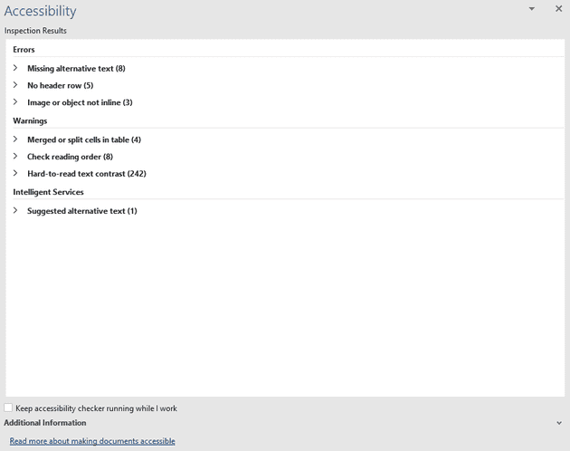
Microsoft Word 365 has a built-in accessibility checker.
You can access it from the ribbon: Review -> Check Accessibility... -> Check Accessibility
Running this checker will identify opportunities to improve accessibility in your document.
Other word processors may have similar features.
The web has done so much to make information available to a huge audience. This quote from Tim Berners-Lee sums it up nicely:
“The power of the Web is in its universality. Access by everyone regardless of disability is an essential aspect”
There’s been a huge amount of work on making content published on the web accessible. Much of that work is embodied in the WCAG. Whilst written for web content, many of the principles can be applied in EIA documents.
Publishing EIAs as websites would go a long way to making them more accessible. It also makes the EIA document more usable. A 600-page EIA published as a single document (usually in .pdf format) can be hard to navigate. The same document published as a well-structured website is much easier to consume. Publishing on the web also enables a whole range of additional content types, such as audio, video, interactive diagrams etc.
Web publishing is the future of EIA documents, and we should be embracing it.
Conclusion
Writing EIA documents in an accessible way may mean changing how we do work. But there are lots of learnings that we can apply from other disciplines to make EIA documents more accessible. As economist John Maynard Keynes said:
“The difficulty lies not so much in developing new ideas as in escaping from old ones.”
The benefits of more accessible EIA documents are worth it.
That’s the end of a fairly long post. I hope you found it useful. Feel free to get in touch if you have any questions or feedback. Thanks for reading!


